 In this post I will give some examples of my part 2 degree work so far. I hope you can see the difference from my previous designs and as always, feel free to comment on anything. Thanks for viewing.
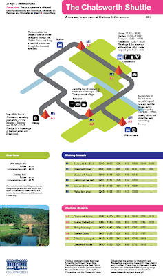
This design was a bus map and timetable to promote Chatsworth country est
ate, as well as a piece of information graphics for use by visitors. It was to be displayed on the bus stops around the estate, not only as a bus map but for visitors to gain insight as to the location of amenities and facilities. I feel that I met the brief in providing a bold, creative solution that not only performed its function, but did so in a legible and comprehendible manner.
Designed September 08

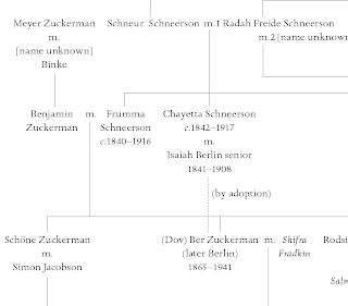
This piece is part of a series of family trees, designed as part of the Real Jobs Scheme to be used in a publication. It made good use of micro typography and attention to small details.
Designed December 08

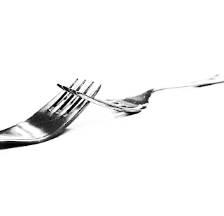
This design was part of a series of 3 short projects. This particular one was to design a series of photographs to portray and communicate certain words, this example shows 'Connection'. It was created using a digital SLR and a single fork that was edited to interlink and appear as two.
Created November to December 08

I created this typeface using FontStruct and only modular shapes. It was to be a modern design but with more traditional characteristics, such as non ranging numbers and alternative swash characters.

The forks only look that good because you used my camera to take the photograph!
ReplyDeleteAnd Photoshop.
Without them you would have no skill! Muhaha!
:p
ReplyDelete